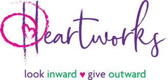
Our New Logo: What Does It Mean To Us?
For the last several months, we have been putting hours of thoughtful work into how we can better share the message of Heartworks. As Heartworkers, we all know how unique and special it is here, but how could we best represent this movement to the world?
One of the first important steps in better communicating our message was to develop a new logo. One that reflects our belief that the more we do our own inner work the more present we are for other people when they are struggling.
Change does not happen easily or lightly. It is a heavy task to leave the logo that has represented us for almost 15 years. The logo that helped start it all. But we also know that change equals growth.
The process of developing a new logo for Heartworks was more than a labor of love….it was a labor of introspection, reflection, prayer, and gratitude. We truly believe this new version represents the soul of Heartworks. Here are some insights as to what each part means:
The heart symbol that helps to make up the “H” represents the action of a “heartwork:” an act of giving that comes from an authentic place within you. The heart is open, with energy spiraling out from its center, representing the action of giving from a place of our own experience with heartache. It speaks to the ongoing and infinite effects that an act of compassion has in our world. One person opens and gives to another and that person has an experience of grace and therefore is more likely to do something for someone else and so on and so on…
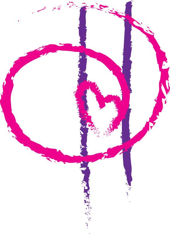
The H
Within the “H” is the echo of the Twin Towers, signifying the emergent place that we all come to at some point in our lives. It represents creating space, in our daily lives, for the same level of awareness and unity that overcame us all in the days following September 11, 2001.
![]()
Look Inward, Give Outward
After 15 years, Heartworks has come to realize that in order for the concepts of Heartworks to really transform us, each of us is called to look inward at our own experience with grief, vulnerability, and gratitude. By doing this we are not simply “mindlessly volunteering,” but truly bringing healing energy into the world through our own life stories. “Look Inward, Give Outward” means to work on ourselves (we offer workshops, meditation groups, prayer walks, self-growth book club, monthly meetings etc..) while giving outward, from a reflective, intentional place. We firmly believe that by doing this, both the giver and receiver are adding connection and love to the world in the purest of ways.
The Font
The font, keeps with the natural, organic, hand written characteristics of the Heartworks Brand. Whenever we give, it comes from a natural, organic intention to help in whatever way fits a person or family best. And we fully believe that in this age of texting and email, there is a power in hand written notes, especially during times of suffering.
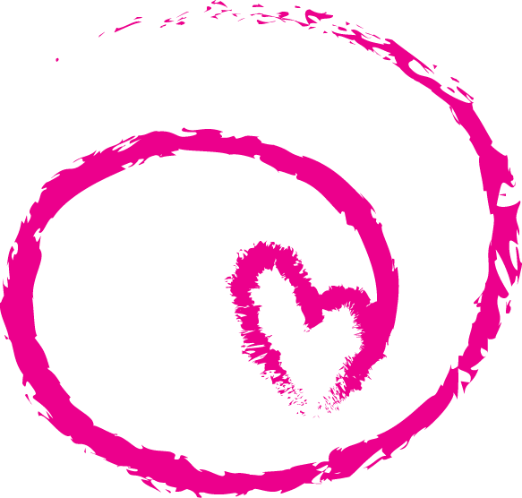
Action Heart Symbol
The Heartworks action symbol is a dynamic image we encourage anyone to use when signing letters or cards, as a way of creating more conscious giving in our world. You start at the base of the heart, draw the heart while leaving an opening, and then draw the swirl. The idea here is that each individual brings her own “heart print” to the work of receiving with grace, giving with an open heart and practicing gratitude.
Our original tag line of “Receive with grace, give with an open heart, and be grateful” will always be the foundation of Heartworks. It speaks to the healing available when we say “YES” to support without guilt, shame or resistance. The idea of giving without judgment and practicing gratitude on a daily basis is a reliable way to invoke more peace in our lives.

